Actionaly
Actionaly
Web app
Web app
Web dashboard for school vendors to track outreach engagement and third-party integrations, supporting data-driven business decisions.
Web dashboard for school vendors to track outreach engagement and third-party integrations, enabling data-driven business decisions.
1st release
1st release

Client & sector
Client & sector
Actionaly - an ed-tech company specializing in family relationship management (FRM) for K-12 schools
Actionaly - an ed-tech company specializing in family relationship management (FRM) for K-12 schools
Collaborators
Collaborators
UX team
CEO and management
Developer team
UX team
CEO and management
Developer team
Role
Role
End-to-end UX Designer
End-to-end UX Designer
Client-Sector
Actionaly - an Ed-tech company specializing in Family Relationship Management (FRM) for K–12 schools
Collaborators
UX Team
CEO
Developer & marketing team
Role
End-to-End UX Designer
Page summary
⏱ 50 sec read
⏱ 4 min read
⏱ 45 sec read
OVERVIEW
Impact & outcomes
User

Improved data access speed, providing near-instant insights for decision-making.
Improved data access speed, providing near-instant insights for decision-making.

Dashboard features for managing user data and API access.
Dashboard features for managing user data and API access.

Easy client access via dashboard channels boosts sales.
Easy client access via dashboard channels boosts sales.
Client / Business

Unlocking revenue growth with expanded partner capacity.
Unlocking revenue growth with expanded partner capacity.

Identified and prioritized key features for the MVP and future iterations.
Identified and prioritized key features for the MVP and future iterations.

Freed up CEO/Sales time with streamlined onboarding and vetting.
Freed up CEO/Sales time with streamlined onboarding and vetting.
Product highlights
Full control & independence
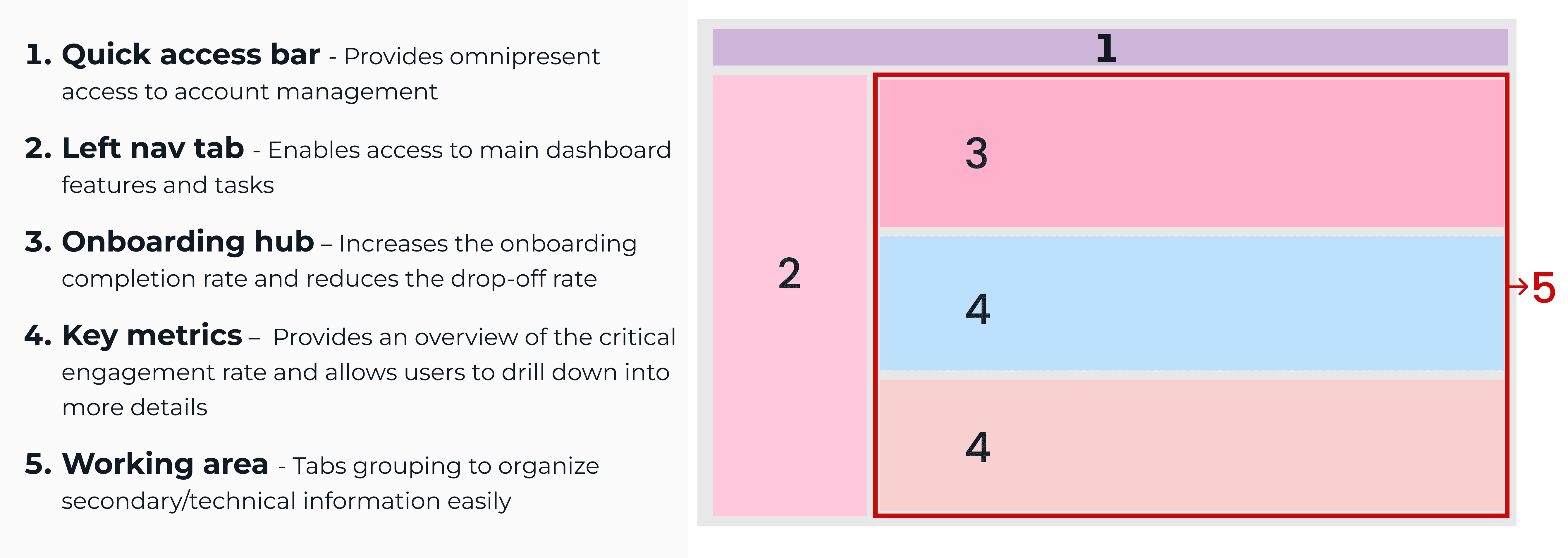
The dashboard’s clean layout centralizes essential tools to track engagement data in real time, access district contact information, and simplify the management of API connections, giving the user complete ownership of workflows.

Empower decision making
Vendor users gain real-time insights into the performance of their product and service campaigns across the school district, enabling smarter decisions.
Increased revenue
Vendors gain access to the school district's contact base to offer their products and services through the dashboard’s connectivity and Actionaly’s integrated messaging system, unlocking the potential for exponential revenue growth.
CASE STUDY
Discovery
The user
The users are vendors who provide products and services to school districts, including digital products, snack services, transportation, and more.
Our client
Actionaly is the first Family Relationship Management (FRM) platform using messaging platforms to connect school communities with vendors.
Users' ecosystem
The vendor dashboard is driven by three main entities and their interconnected relationships.

School Districts
Tenants: Parents, teachers, etc.

Client
Connects the schools and vendors.

User
Vendors serving schools.


Understanding the problem & Approach
Actionaly provides on-demand communication to vendors and manually generates reports, leading to slow processes and other challenges. We aligned on Actionaly’s needs, capabilities, and limitations to set a clear objective and adopted a linear, multi-phase approach with weekly sprints to ensure a fast launch.
Problem
Vendors lack real-time engagement feedback from school district users.
High volume of vendor support requests (integrations, admin, and more).
Vendor onboarding is a lengthy process.
Goals
Empower vendors with actionable insights from school district users.
Reduce vendor support requests by improving self-service and workflow clarity.
Speed up and simplify vendor onboarding.
Design process
From research to design
IDEATION - User interviews & client documentation
We conducted in-depth user interviews and analyzed documentation to identify needs and limitations. These insights shaped the project vision and informed the initial site map presented to the client, ensuring alignment before moving into design execution.
Sitemap
Mindmap
Tags
Color-code
Proposed sitemap for client review and approval

Sitemap
Proposed sitemap for client review and approval.
PIONEERING - Benchmarking existing solutions
Actionaly’s Family Relationship Management (FRM) platform is the first of its kind. To inform the vendor dashboard design, we analyzed comparable ed-tech and CRM platforms to reduce user friction and leverage established design patterns in defining the dashboard's layout.
Navigation
Structure
Benchmarking
Hybrid navigation

Hybrid navigation

Standard dashboard structures across EdTech and CRM Tools

PIVOT - Lean MVP research
As the project timeline accelerated, we focused on defining a realistic MVP. To prioritize key dashboard features, we conducted card sorting sessions with internal and external users, helping identify the most critical functionality.
Primary
Secondary
Research
Primary features

Primary features
RESEARCH - Ideate analytics section
As part of the UX team, I led the design of the analytics page, using desk research and competitive analysis to define key engagement KPIs and UI patterns that shaped the dashboard.
Design
Research
Data visualization is designed to deliver clear, actionable insights that support informed business decisions.
Key KPI selection

Numerical & visual data

Message delivery insights

Temporal data insights

Design
Research
Industry-standard patterns and insights drawn from engagement science and data visualization best practices
Consistent error notification
Key performance indicators (KPIs)
Display outreach performance metrics
Filter and visualization controls
Data display hierarchy
Flexible data visualization charts

Design
Research
Data Visualization is designed to deliver clear, actionable insights that support informed business decisions.
Key KPI selection
Numerical & visual data
Message delivery insights
Temporal data insights
ITERATIVE DESIGN - Incorporating user feedback
Internal and external user feedback was analyzed and validated; we prioritized frequent feedback patterns to inform key design decisions.
ITERATIVE DESIGN - Incorporating user feedback
Graphics layout
Filter system
Contextual panel
Communication log
Representative Quote
"With so many elements on the screen, it's often hard to track the data on a graphic; everything can feel overwhelming"
Industry–standard patterns and insights drawn from engagement science and data visualization best practices.
Visual controls
Hidden when not in use, preserving a clean layout
Customized Visuals
Reduce visual clutter and maintain consistency
Color Contrast
Ensuring clear distinction between data segments
Tooltips on hover
Reduce visual clutter and help with Visual emphasis

Representative Quote
"With so many elements on the screen, it's often hard to track the data on a graphic; everything can feel overwhelming"
Industry-standard patterns and insights drawn from engagement science and data visualization best practices
Visual controls
Hidden when not in use, preserving a clean layout
Customized Visuals
Reduce visual clutter and maintain consistency
Color Contrast
Ensuring clear distinction between data segments
Tooltips on hover
Reduce visual clutter and help with Visual emphasis
KEY CHALLENGES & LEARNINGS

The initial project scope could not be fully delivered due to tighter client time constraints introduced mid-project.
We relied on client alignment meetings, user feedback, and desk research analysis for MVP scope definition.
We relied on client alignment meetings, user feedback, and desk research analysis for MVP scope definition.
The user segment is highly niche, making high-equity business owners and senior management notably hard to engage and recruit.
We engaged Actionaly’s partners to establish a user-led discovery process for early-stage conceptual mapping.
Due to time constraints, usability testing was not conducted, raising concerns about final user validation of the designs.
The UX team validated dashboard features through internal and external user feedback, trend analysis, best practice research, and final client review.
The initial project scope could not be fully delivered because the client imposed tighter time constraints midway through the project.
We relied on client alignment meetings, user feedback, and desk research analysis for MVP scope definition.
The user segment is highly niche, making high-equity business owners and senior management notably hard to engage and recruit.
We engaged Actionaly’s partners to establish a user-led discovery process for early-stage conceptual mapping.
Due to time constraints, usability testing was not conducted, raising concerns about final user validation of the designs.
The UX team validated dashboard features through internal and external user feedback, trend analysis, best-practice research, and a final client review.
LEARNINGS
Through this project, I strengthened my understanding of B2B systems and API integrations within a school district vendor ecosystem. I learned that designing for a specialized audience requires balancing direct user insights with market research and cross-functional collaboration. Implementing a structured user feedback loop highlighted the value of continuous improvement and reinforced the importance of scalable systems, clear data presentation, and thoughtful iteration in complex institutional environments.
Actionaly
Actionaly
Web app
Web app
Web dashboard for school vendors to track outreach engagement and third-party integrations, supporting data-driven business decisions.
Web dashboard for school vendors to track outreach engagement and third-party integrations, enabling data-driven business decisions.
1st release
1st release
Client & sector
Client & sector
Actionaly - an ed-tech company specializing in family relationship management (FRM) for K-12 schools
Actionaly - an ed-tech company specializing in family relationship management (FRM) for K-12 schools
Collaborators
Collaborators
UX team
CEO and management
Developer team
UX team
CEO and management
Developer team
Role
Role
End-to-end UX Designer
End-to-end UX Designer
Client-Sector
Actionaly - an Ed-tech company specializing in Family Relationship Management (FRM) for K–12 schools
Collaborators
UX Team
CEO
Developer & marketing team
Role
End-to-End UX Designer
Page summary
⏱ 50 sec read
⏱ 4 min read
⏱ 45 sec read
OVERVIEW
Impact & outcomes
User
Improved data access speed, providing near-instant insights for decision-making.
Improved data access speed, providing near-instant insights for decision-making.
Dashboard features for managing user data and API access.
Dashboard features for managing user data and API access.
Easy client access via dashboard channels boosts sales.
Easy client access via dashboard channels boosts sales.
Client / Business
Unlocking revenue growth with expanded partner capacity.
Unlocking revenue growth with expanded partner capacity.
Identified and prioritized key features for the MVP and future iterations.
Identified and prioritized key features for the MVP and future iterations.
Freed up CEO/Sales time with streamlined onboarding and vetting.
Freed up CEO/Sales time with streamlined onboarding and vetting.
Product highlights
Full control & independence
The dashboard’s clean layout centralizes essential tools to track engagement data in real time, access district contact information, and simplify the management of API connections, giving the user complete ownership of workflows.
Empower decision making
Vendor users gain real-time insights into the performance of their product and service campaigns across the school district, enabling smarter decisions.
Increased revenue
Vendors gain access to the school district's contact base to offer their products and services through the dashboard’s connectivity and Actionaly’s integrated messaging system, unlocking the potential for exponential revenue growth.
CASE STUDY
Discovery
The user
The users are vendors who provide products and services to school districts, including digital products, snack services, transportation, and more.
Our client
Actionaly is the first Family Relationship Management (FRM) platform using messaging platforms to connect school communities with vendors.
Users' ecosystem
The vendor dashboard is driven by three main entities and their interconnected relationships.
School Districts
Tenants: Parents, teachers, etc.
Client
Connects the schools and vendors.
User
Vendors serving schools.
Understanding the problem & Approach
Actionaly provides on-demand communication to vendors and manually generates reports, leading to slow processes and other challenges. We aligned on Actionaly’s needs, capabilities, and limitations to set a clear objective and adopted a linear, multi-phase approach with weekly sprints to ensure a fast launch.
Problem
Vendors lack real-time engagement feedback from school district users.
High volume of vendor support requests (integrations, admin, and more).
Vendor onboarding is a lengthy process.
Goals
Empower vendors with actionable insights from school district users.
Reduce vendor support requests by improving self-service and workflow clarity.
Speed up and simplify vendor onboarding.
Design process
From research to design
IDEATION - User interviews & client documentation
We conducted in-depth user interviews and analyzed documentation to identify needs and limitations. These insights shaped the project vision and informed the initial site map presented to the client, ensuring alignment before moving into design execution.
Sitemap
Mindmap
Tags
Color-code
Proposed sitemap for client review and approval
Sitemap
Proposed sitemap for client review and approval.
PIONEERING - Benchmarking existing solutions
Actionaly’s Family Relationship Management (FRM) platform is the first of its kind. To inform the vendor dashboard design, we analyzed comparable ed-tech and CRM platforms to reduce user friction and leverage established design patterns in defining the dashboard's layout.
Navigation
Structure
Benchmarking
Hybrid navigation
Hybrid navigation
Standard dashboard structures across EdTech and CRM Tools
PIVOT - Lean MVP research
As the project timeline accelerated, we focused on defining a realistic MVP. To prioritize key dashboard features, we conducted card sorting sessions with internal and external users, helping identify the most critical functionality.
Primary
Secondary
Research
Primary features
Primary features
RESEARCH - Ideate analytics section
As part of the UX team, I led the design of the analytics page, using desk research and competitive analysis to define key engagement KPIs and UI patterns that shaped the dashboard.
Design
Research
Data visualization is designed to deliver clear, actionable insights that support informed business decisions.
Key KPI selection
Numerical & visual data
Message delivery insights
Temporal data insights
Design
Research
Industry-standard patterns and insights drawn from engagement science and data visualization best practices
Consistent error notification
Key performance indicators (KPIs)
Display outreach performance metrics
Filter and visualization controls
Data display hierarchy
Flexible data visualization charts
Design
Research
Data Visualization is designed to deliver clear, actionable insights that support informed business decisions.
Key KPI selection
Numerical & visual data
Message delivery insights
Temporal data insights
ITERATIVE DESIGN - Incorporating user feedback
Internal and external user feedback was analyzed and validated; we prioritized frequent feedback patterns to inform key design decisions.
ITERATIVE DESIGN - Incorporating user feedback
Graphics layout
Filter system
Contextual panel
Communication log
Representative Quote
"With so many elements on the screen, it's often hard to track the data on a graphic; everything can feel overwhelming"
Industry–standard patterns and insights drawn from engagement science and data visualization best practices.
Visual controls
Hidden when not in use, preserving a clean layout
Customized Visuals
Reduce visual clutter and maintain consistency
Color Contrast
Ensuring clear distinction between data segments
Tooltips on hover
Reduce visual clutter and help with Visual emphasis
Representative Quote
"With so many elements on the screen, it's often hard to track the data on a graphic; everything can feel overwhelming"
Industry-standard patterns and insights drawn from engagement science and data visualization best practices
Visual controls
Hidden when not in use, preserving a clean layout
Customized Visuals
Reduce visual clutter and maintain consistency
Color Contrast
Ensuring clear distinction between data segments
Tooltips on hover
Reduce visual clutter and help with Visual emphasis
KEY CHALLENGES & LEARNINGS
The initial project scope could not be fully delivered due to tighter client time constraints introduced mid-project.
We relied on client alignment meetings, user feedback, and desk research analysis for MVP scope definition.
We relied on client alignment meetings, user feedback, and desk research analysis for MVP scope definition.
The user segment is highly niche, making high-equity business owners and senior management notably hard to engage and recruit.
We engaged Actionaly’s partners to establish a user-led discovery process for early-stage conceptual mapping.
Due to time constraints, usability testing was not conducted, raising concerns about final user validation of the designs.
The UX team validated dashboard features through internal and external user feedback, trend analysis, best practice research, and final client review.
The initial project scope could not be fully delivered because the client imposed tighter time constraints midway through the project.
We relied on client alignment meetings, user feedback, and desk research analysis for MVP scope definition.
The user segment is highly niche, making high-equity business owners and senior management notably hard to engage and recruit.
We engaged Actionaly’s partners to establish a user-led discovery process for early-stage conceptual mapping.
Due to time constraints, usability testing was not conducted, raising concerns about final user validation of the designs.