T.Mobile
Mobile App
———————
Mobile app designed to showcase car inventory and help users efficiently sort vehicles through swipe-based or list-focused browsing, supporting stronger engagement and more informed decision-making.
Investor-Ready Product Concept

Client-Sector
Health & Wellness - FemTech - Marketplace
Collaborators
CEO
UX Team
Role
UX/UI Lead - Home & marketplace page
Page summary
⏱ 3 min read
⏱ 10 min read
⏱ 1 min read
OVERVIEW
Impact & Outcomes
User

After redesigning the purchase flow based on user testing, we addressed key pain points and delivered a more streamlined experience.

The homepage received 100% user approval, with all participants understanding the app’s concept and value.
Client / Business

The look-and-feel mockups attracted interest, increased credibility, and secured investor meetings.

Created a flexible, investor-ready concept positioned to attract cross-market investment opportunities.
Product highlights
40+ prospective investors
The look and feel was informed by user testing insights, reflecting user sentiment while aligning with business goals, which strengthened the pitch and generated investor interest.

100% user approval
All users provided positive feedback on the homepage, clearly understanding the company’s values, suggestion processes, and app functionality, which demonstrated a trustworthy experience.
UX design aligning users and business needs
Integrated product ingredient info with a personalized shopping system, enabling limitless styles for product descriptions, while balancing user research insights and client needs to create an intuitive, engagement-driving experience.
CASE STUDY
Discovery
The user
The app’s primary user is a woman seeking natural solutions for menopause symptoms. She values trusted information, simplicity, and personalized guidance to make informed choices about supplements and lifestyle changes.
Our client
A visionary CEO in the health and wellness industry, launching a lean digital MVP for menopause support, with a strategic roadmap to scale into a broader marketplace and incorporate AI-driven personalization in future iterations.
Understanding the problem & Approach
Health-sensitive users often face challenges due to their personal health needs and a saturated market of supplements and recommendations.
Problem
Users seeking menopause supplements often struggle with trust.
They encounter unclear product information.
They face confusing navigation, making purchases stressful and uncertain.
Goals
Build user trust by clearly communicating company values and product information
Provide intuitive navigation for easy discovery of supplements.
Create a smooth and satisfying buying experience.
Design process
From research to design
DISCOVERY - Market analysis and client alignment
Following multiple client workshops and the creation of a preliminary user flow, we conducted comprehensive desk research on marketplaces, recommendation engines, and menopause supplement systems. All relevant findings were systematically documented in a centralized research app with color-coded annotations to inform the architecture phase.


DEFINE - High-level information architecture
Following client alignment and a review of the comparative analysis results, the UX team defined a high-level information architecture for the app. At this stage, I took ownership of the homepage and marketplace, defining their structure and creating a high-level requirements map for each section to ensure alignment with the client.


RESEARCH - Usability text
We provided our client with actionable insights for investors, developers, and other stakeholders by conducting, analyzing, and presenting the results of a usability test to evaluate the overall app concept, measure user acceptance, and identify preferences for usability and functionality.
Home page usability test
Market place usability test
RESULTS
Post-usability testing, priorities, and resources were assigned to address identified issues. Findings drove the implemented changes below.
Global search bar
User research showed that while the search bar was initially planned only for the Marketplace, 66% of users expected to find search on the homepage to support faster and easier product discovery. Based on this insight, the decision was made to place the search functionality in the top navigation, enabling global, multi-context search across the app.


Top-level product category tab navigation and acceptance
The top-level product category tabs achieved 100% task success across users. However, one user experienced minor friction with the “All Inventory” label and suggested “All Products” as a clearer alternative. The design was retained, with labeling and navigation flagged for continued monitoring due to the issue's low priority.

Contextual title
30% of users were confused about why products were recommended to them. To improve this, we added a clarity layer to the Suggested Products section, helping users understand the reasoning behind each recommendation.
User Quote: "I do not understand why these are my recommended products. Who is recommending them?"


Product card engagement and user trust
The Product Card achieved 60% user satisfaction and successful task completion, indicating overall usability. However, 33% of users felt intimidated by the Buy button when it was the first interaction with a suggested product. The redesign incorporates multi-state purchase option buttons, allowing users to engage with different purchase flows, reducing interaction anxiety, and improving the overall conversion path.
User Quote “The buy so soon feels like cold selling, which could be off-putting to users.”


Product page navigation and user acceptance
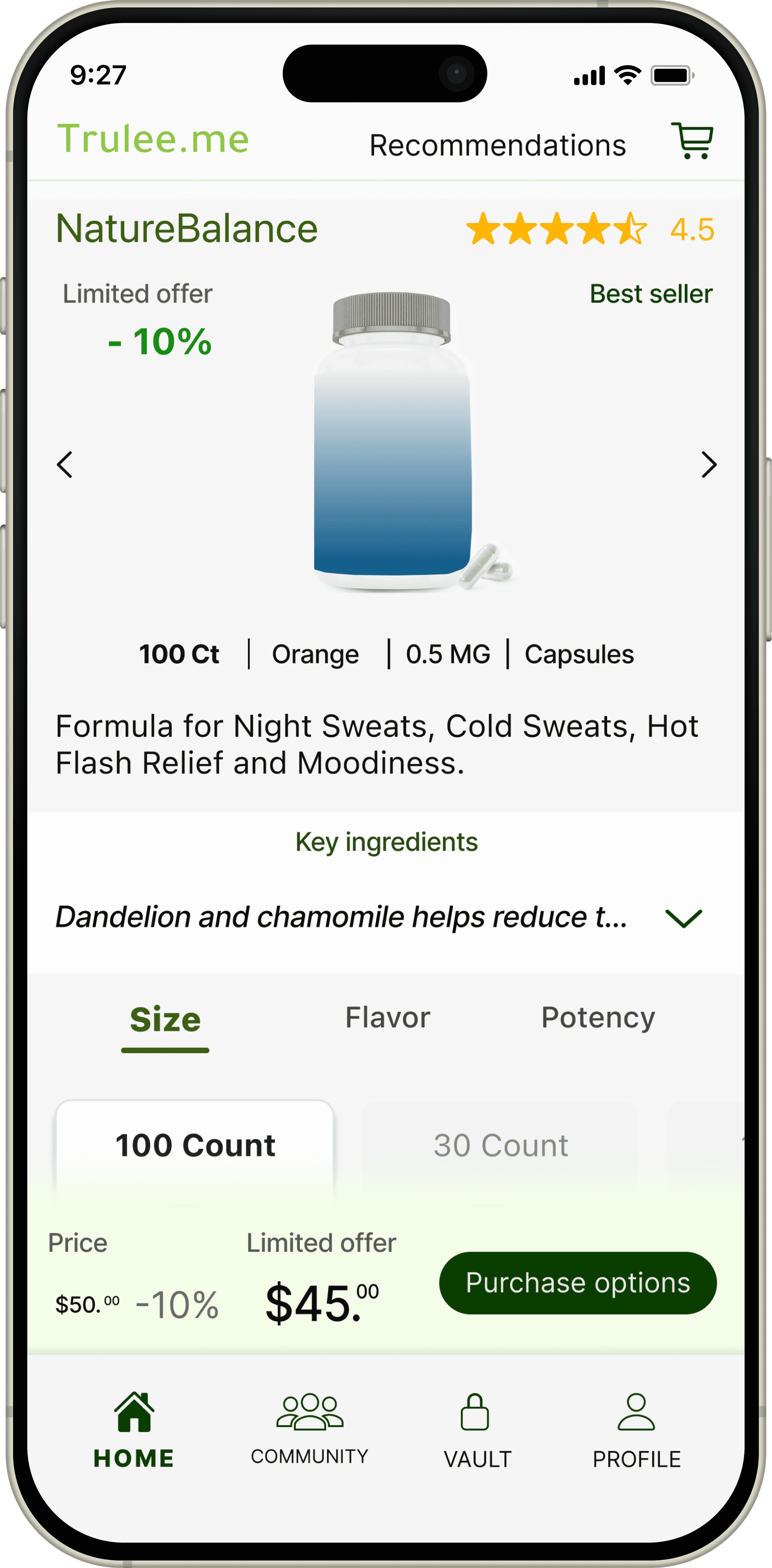
All users reported a positive interaction with the product page, particularly regarding navigation and overall acceptance. However, 66% indicated a need for faster access to key ingredients and their symptom-relief benefits. The redesign introduces a dedicated layer highlighting ingredient benefits, with a visual focal point and expanded entry point to improve discoverability and reduce cognitive load.

See full product page
↓
Homepage overall usability and user acceptance
We evaluated the homepage against three core UX pillars: Engagement and discovery, trust and credibility, and education of app's systems with user privacy reassurance. Usability testing showed that 100% of participants provided positive feedback, reporting confidence in the information architecture and content needed to effectively navigate and engage with the app.
Homepage scroll experience


Concept Look & Feel Mockups and mood palette
Based on the logo and user expectations for a vibrant yet calm app, I created an initial color palette for the first mockup and investor meetings. Full palette refinement will follow in later research due to timeline constraints.

Product page

Home page

KEY CHALLENGES & LEARNINGS

Conducting user research for individuals in a health-sensitive context while ensuring usability testing is respectful of their experiences and still gathers objective feedback.
Educated the team through research and workshops, then designed carefully worded tasks and prompts to respect users’ experiences while gathering actionable insights.
Designing a look-and-feel mockup with limited time and resources while making it polished and presentable for investor meetings.
Prioritized key screens, defined core visual elements, and incorporated mood and sentiment questions into the usability test.
The app’s concept and design were still evolving, changing frequently, and not yet settled because of ongoing discussions with the client and partners.
Established a flexible design system anchored in the core app concept, allowing iterative development while maintaining constant and open communication with the client.
LEARNINGS
Through this project, I strengthened my understanding of B2B systems and API integrations within a school district vendor ecosystem. I learned that designing for a specialized audience requires balancing direct user insights with market research and cross-functional collaboration. Implementing a structured user feedback loop highlighted the value of continuous improvement and reinforced the importance of scalable systems, clear data presentation, and thoughtful iteration in complex institutional environments.
T.Mobile
Mobile App
———————
Mobile app designed to showcase car inventory and help users efficiently sort vehicles through swipe-based or list-focused browsing, supporting stronger engagement and more informed decision-making.
Investor-Ready Product Concept
Client-Sector
Health & Wellness - FemTech - Marketplace
Collaborators
CEO
UX Team
Role
UX/UI Lead - Home & marketplace page
Page summary
⏱ 3 min read
⏱ 10 min read
⏱ 1 min read
OVERVIEW
Impact & Outcomes
User
After redesigning the purchase flow based on user testing, we addressed key pain points and delivered a more streamlined experience.
The homepage received 100% user approval, with all participants understanding the app’s concept and value.
Client / Business
The look-and-feel mockups attracted interest, increased credibility, and secured investor meetings.
Created a flexible, investor-ready concept positioned to attract cross-market investment opportunities.
Product highlights
40+ prospective investors
The look and feel was informed by user testing insights, reflecting user sentiment while aligning with business goals, which strengthened the pitch and generated investor interest.
100% user approval
All users provided positive feedback on the homepage, clearly understanding the company’s values, suggestion processes, and app functionality, which demonstrated a trustworthy experience.
UX design aligning users and business needs
Integrated product ingredient info with a personalized shopping system, enabling limitless styles for product descriptions, while balancing user research insights and client needs to create an intuitive, engagement-driving experience.
CASE STUDY
Discovery
The user
The app’s primary user is a woman seeking natural solutions for menopause symptoms. She values trusted information, simplicity, and personalized guidance to make informed choices about supplements and lifestyle changes.
Our client
A visionary CEO in the health and wellness industry, launching a lean digital MVP for menopause support, with a strategic roadmap to scale into a broader marketplace and incorporate AI-driven personalization in future iterations.
Understanding the problem & Approach
Health-sensitive users often face challenges due to their personal health needs and a saturated market of supplements and recommendations.
Problem
Users seeking menopause supplements often struggle with trust.
They encounter unclear product information.
They face confusing navigation, making purchases stressful and uncertain.
Goals
Build user trust by clearly communicating company values and product information
Provide intuitive navigation for easy discovery of supplements.
Create a smooth and satisfying buying experience.
Design process
From research to design
DISCOVERY - Market analysis and client alignment
Following multiple client workshops and the creation of a preliminary user flow, we conducted comprehensive desk research on marketplaces, recommendation engines, and menopause supplement systems. All relevant findings were systematically documented in a centralized research app with color-coded annotations to inform the architecture phase.
DEFINE - High-level information architecture
Following client alignment and a review of the comparative analysis results, the UX team defined a high-level information architecture for the app. At this stage, I took ownership of the homepage and marketplace, defining their structure and creating a high-level requirements map for each section to ensure alignment with the client.
RESEARCH - Usability text
We provided our client with actionable insights for investors, developers, and other stakeholders by conducting, analyzing, and presenting the results of a usability test to evaluate the overall app concept, measure user acceptance, and identify preferences for usability and functionality.
Home page usability test
Market place usability test
RESULTS
Post-usability testing, priorities, and resources were assigned to address identified issues. Findings drove the implemented changes below.
Global search bar
User research showed that while the search bar was initially planned only for the Marketplace, 66% of users expected to find search on the homepage to support faster and easier product discovery. Based on this insight, the decision was made to place the search functionality in the top navigation, enabling global, multi-context search across the app.
Top-level product category tab navigation and acceptance
The top-level product category tabs achieved 100% task success across users. However, one user experienced minor friction with the “All Inventory” label and suggested “All Products” as a clearer alternative. The design was retained, with labeling and navigation flagged for continued monitoring due to the issue's low priority.
Contextual title
30% of users were confused about why products were recommended to them. To improve this, we added a clarity layer to the Suggested Products section, helping users understand the reasoning behind each recommendation.
User Quote: "I do not understand why these are my recommended products. Who is recommending them?"
Product card engagement and user trust
The Product Card achieved 60% user satisfaction and successful task completion, indicating overall usability. However, 33% of users felt intimidated by the Buy button when it was the first interaction with a suggested product. The redesign incorporates multi-state purchase option buttons, allowing users to engage with different purchase flows, reducing interaction anxiety, and improving the overall conversion path.
User Quote “The buy so soon feels like cold selling, which could be off-putting to users.”
Product page navigation and user acceptance
All users reported a positive interaction with the product page, particularly regarding navigation and overall acceptance. However, 66% indicated a need for faster access to key ingredients and their symptom-relief benefits. The redesign introduces a dedicated layer highlighting ingredient benefits, with a visual focal point and expanded entry point to improve discoverability and reduce cognitive load.
See full product page
↓
Homepage overall usability and user acceptance
We evaluated the homepage against three core UX pillars: Engagement and discovery, trust and credibility, and education of app's systems with user privacy reassurance. Usability testing showed that 100% of participants provided positive feedback, reporting confidence in the information architecture and content needed to effectively navigate and engage with the app.
Homepage scroll experience
Concept Look & Feel Mockups and mood palette
Based on the logo and user expectations for a vibrant yet calm app, I created an initial color palette for the first mockup and investor meetings. Full palette refinement will follow in later research due to timeline constraints.
Product page
Home page
KEY CHALLENGES & LEARNINGS